Printing on Kraft vs White Paperboard: What Changes in Your Brand Colors?
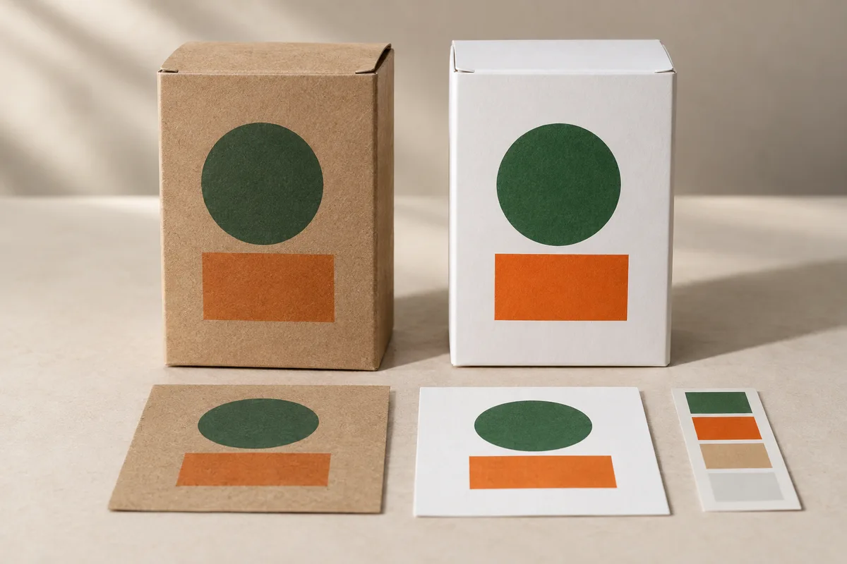
The same artwork can look different on brown and white stock. Set up the sample comparison so you can distinguish substrate effects from ink, finish and proofing differences.
The same artwork can look different on kraft and white paperboard because the stock contributes to the printed color. Before adjusting a design that looks wrong on kraft, check what the printer used: the board, inks, surface finish and any white underprint. Changing the artwork may not address the source of the difference.
Approve the color on a physical sample that identifies the stock and printing conditions. A logo approved on screen gives the printer a design reference, but not an agreed production result.
Why the same artwork can look different
The substrate is part of the color result. X-Rite's discussion of color accuracy across packaging materials explains why a color approved on white material may look different on brown corrugated board. For a kraft carton, check that effect on the actual board and printing process proposed for the order.
Ask for the stock reference and printed side. “Kraft” does not specify one shade of brown, and “white paperboard” does not identify its coating or suitability for the printing process. Record the material used for the approved sample.
The comparison also needs a consistent finish. A matte surface and a glossy surface can present the artwork differently. If the kraft sample is uncoated but the white sample is laminated, the buyer is comparing more than substrate color. You can compare those finished options, but you cannot attribute the entire difference to the board.
Identify the color-critical parts of the design
Identify the elements that matter most before requesting a sample. A large brand-color panel, a pale illustration, fine reversed text and a product photograph do not place the same demands on a printed surface. Mark the color-critical areas in the artwork rather than writing “match everything exactly” in an email.
Give the printer a usable reference. Where the brand already has an approved physical standard or specified color data, state which one controls. If the reference is only an image from a website, say so. The first sample may need to establish an achievable production target rather than confirm an existing one.
Also distinguish artwork intent from manufacturing instruction. A white shape in the design file might mean unprinted white paper on one job and an actual white ink area on another. If that distinction is not stated, two suppliers can interpret the same file differently while both believing they followed the artwork.
Discuss white ink before relying on it
White ink on kraft packaging is a production option to discuss, not an automatic feature of every printing process. Ask whether the proposed equipment and material support it, how the white layer will be prepared and which artwork elements require it. Do not assume that choosing a white swatch in a design application creates a printable white separation.
If a white underprint is proposed beneath colored artwork, evaluate that combination on the intended stock. Review the visibility of the white edge, alignment with the overprinted image and the resulting surface. The supplier should explain the file setup and approval route for that job.
If the available process cannot reproduce an essential pale image or brand color on kraft, consider white paperboard. If the design deliberately uses the brown background, approve a reference on that stock rather than expecting it to match an unrelated white-board sample.
Compare samples with one variable changed at a time
Use the same artwork revision when comparing stock options. Keep a note of anything else that changes, including print process, white ink, coating and finishing. Otherwise a buyer may attribute the entire difference to the board when the samples were produced under different conditions.
X-Rite's packaging substrate color workflow describes creating color targets and ink recipes for the chosen substrate. Agree on the color target and material together; some original colors may not be achievable on the selected stock.
| Record field | What the sample record should identify |
|---|---|
| Artwork | File name, revision and the design areas being evaluated |
| Substrate | Supplier material reference and printed side |
| Printing | Printing process and ink system, not simply “CMYK” |
| White layer | Used or not used, with the relevant artwork areas identified |
| Surface finish | Coating, lamination or uncoated appearance |
| Reference | Physical target or agreed color specification |
| Decision | Accepted appearance, unresolved issues and approval authority |
If color will be accepted against a measured tolerance, agree on the measurement method, conditions and limit with the supplier. Record them with the physical reference.
Separate structural approval from color approval
A plain structural sample can answer questions about fit and assembly without representing the final printed appearance. A printed mock-up may be useful for layout but may use a different process or material from production. Record those limitations beside the approval, not only in a supplier's earlier email.
For example, approving the location of a logo on a digital sample does not necessarily approve its final color or a metallic finish. The same distinction applies to a kraft-looking texture printed on white board: it is a printed design, not evidence of natural kraft material.
Our packaging prototype approval guide explains what different sample types can establish. Record whether a sample was approved for structure, artwork position, color or all three.
Review the artwork on an erected carton
Erect the carton before signing off on the design. Look at how the artwork wraps across panels, whether the opening sequence hides important information and where the most color-critical area sits in relation to closures or finishing operations.
Inspect small text and reversed elements at the intended size. Do not enlarge the image on a screen and assume the final package will be equally easy to read. Ask for a production review of fine elements rather than giving the printer an arbitrary minimum that may not suit the material and process.
Check barcode artwork separately from the visual design. Even if its position looks balanced, the symbol still needs the appropriate production and verification checks. Brand-color preference should not override the requirements of machine-readable information.
Avoid changing the wrong part of the job
If the first kraft sample looks duller than expected, first establish what was printed. Changing the artwork, ink system and substrate simultaneously makes it difficult to know which change produced the next result. Ask the supplier to identify the variables and propose a controlled next sample.
Before adding an ink layer or finish, ask what it should improve and how the next sample will demonstrate that improvement. Confirm the cost and production implications before approving the change.
For a broader process choice, refer to offset versus digital printing for packaging. Check the process against the intended stock before comparing prices.
Send a color-specific packaging inquiry
When discussing custom folding cartons, include the proposed board appearance, artwork, physical brand reference if available and the areas where color is critical. Say whether white ink is essential or only an option to investigate. Include the required quantity and any finish that must remain constant.
Ask the supplier what the next sample will demonstrate. A clear response should identify the material and process, the target being evaluated and any remaining difference from production. This gives the printer specific feedback to act on, rather than another comment that the colors are “not quite right.”
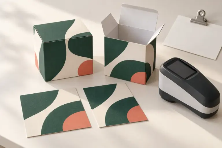
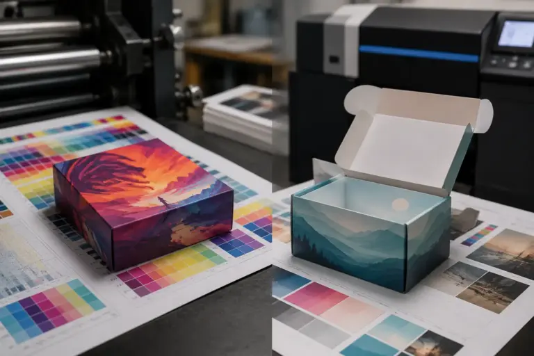
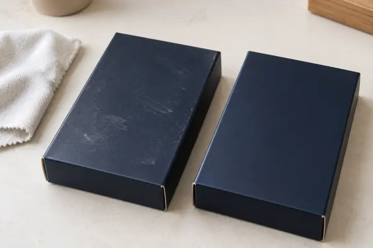
Image note: the featured kraft and white samples are AI-generated illustrations. Their colors are not measured proofs or a prediction of a particular printing process.